Capital Partners for Education
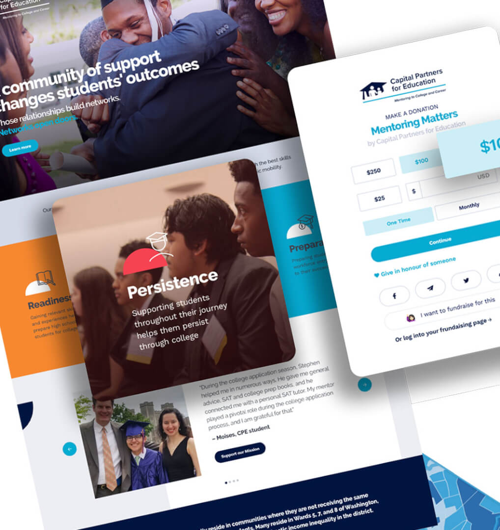
Now more than ever, high-paying jobs require a college diploma. Working to help low-income and first-generation students achieve this feat, Capital Partners for Education provides mentoring services and vital resources for aspiring youths. Currently supporting 470 students throughout the DC area, CPE harnesses the power of strong mentor/mentee relationships to inspire young students to succeed in high school, college, and beyond.
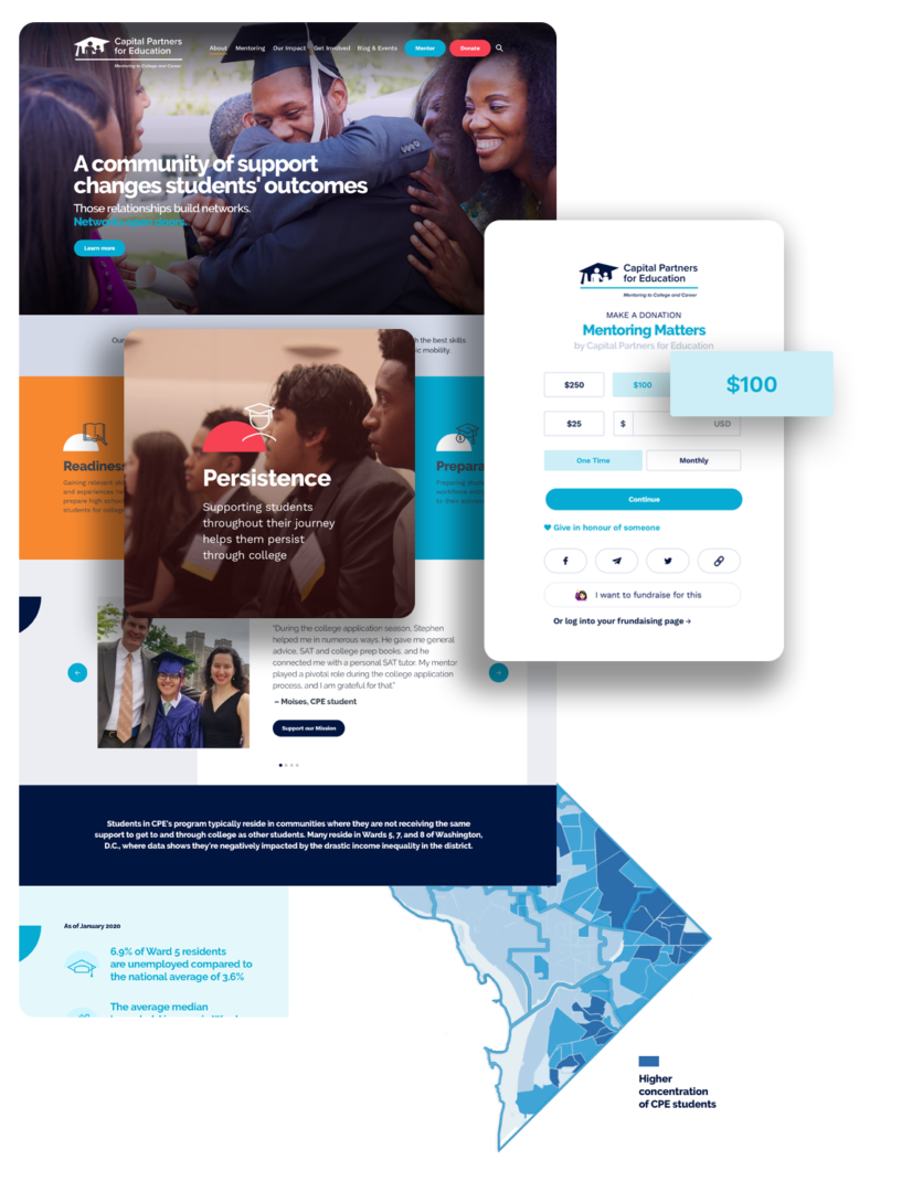
After 27 years as an organization, CPE was ready to venture into the next stage of their organization. Equipped with a recently refreshed brand, they needed a website to match. Our team helped CPE solidify their new branding through a robust website that honors their history and looks to the future.
Nonprofit Sector
Year
2020
Scope of Work
- Brand Style Guide
- User Experience
- Website Design & Development
Steps to Completion

A Brand to Stand Behind
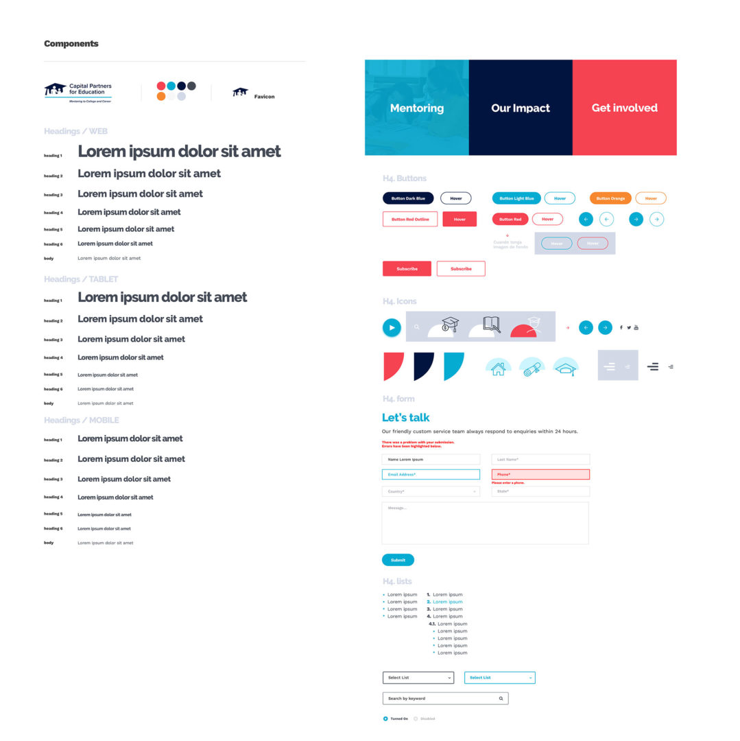
Capital Partners for Education renovated and refreshed key components of their organization, which included rebranding, a new logo, an updated mission statement, updating their values: the works. As they entered a new era for their organization, CPE prioritized protecting, upholding, and utilizing their new brand to the fullest potential. What better way to start than with a Brand Style Guide? A resource for all members of their team, both present and future, the CPE brand can remain strong and true through all their endeavors.
Iris Blue
#05ABD2
Prussian Blue
#001540
Carnation
#F64252
Graduation - The New Website
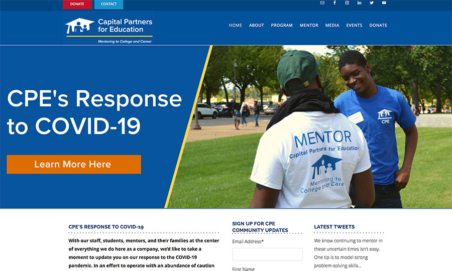
Before
CPE’s previous website had an outdated design, was loaded with content, and was difficult to navigate. Their new site needed to match the excellence of their recently designed logo.
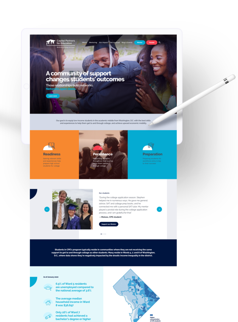
After
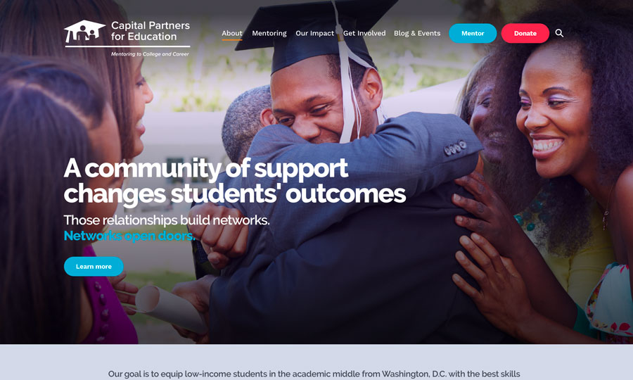
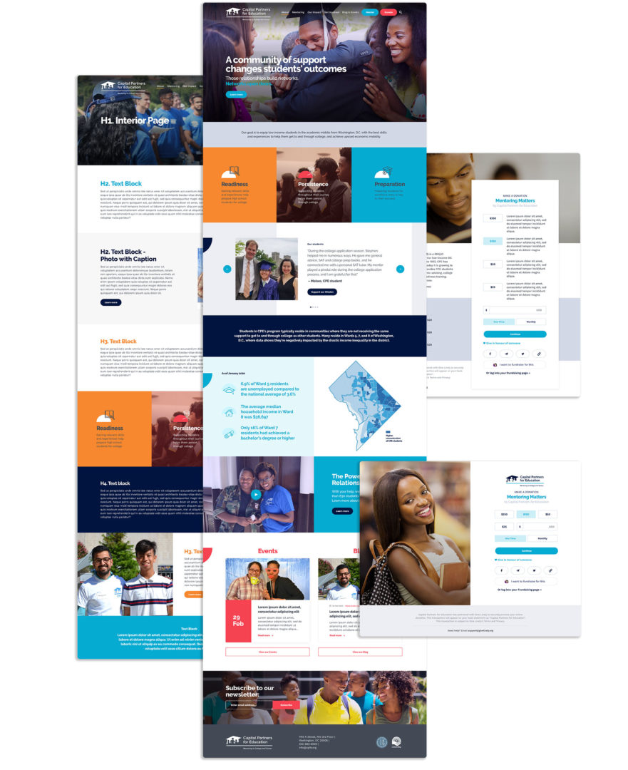
CEP’s new website is easy to navigate, has a beautiful design, and has made it easy both for new mentors to volunteer and for new donors to get involved.
Website Goal 1
Setting Up for Success
One important goal for CPE’s new website was to advertise and streamline sign-up for the mentoring program. Interested mentors now have access to the program’s mechanics and the potential impact of their participation before applying. A new “What it takes to be a mentor” page and extensive new content on the impact of mentorship makes this possible. The application is built into the website and available on the header as well.
Website Goal 2
Embarking upon the Future
The final step of their website journey? Search Engine Optimization. Through extensive keyword research, incorporation of keywords into website content, and integration of the YOAST SEO plugin, Capital Partners for Education is easily discoverable online. Now, CPE is ready to embark on the next stage of their nonprofit’s journey. The new brand and streamlined mentoring process will help CPE continue to impact DC youths’ lives for the better.

“Working with Elevation Web, and in particular our project manager, Alura, was a great experience. Our new look matches our new brand. Due to Elevation's experience working solely with nonprofit organizations, they were able to bring our mission and impact to the forefront of each page.”
Danielle TylerCommunications & Marketing Director
